

My concept was to create a broadside in the style of the 17th century following examples I had seen. Thus the black letter Old English text and the Caslon title. The border was not exactly in a style of that age but was the closest I had. I picked a Strathmore all-cotton laid paper I got with the press along with most of the original equipment for my shop.
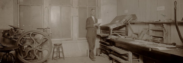
A number of problems cropped up right away, things that had not been so evident on the small forms I had printed to that point such as a business card. First was the roller and truck issue as it affected inking the form. The perf cuts in the rollers were bad at one place and created a white line that moved around slightly. The truck tires being out of round caused their own difficulties. And to add insult to injury I realized that the platen I had so carefully adjusted needed tweaking. I could deal with the platen but had to live with the rollers and trucks for the time being, not being able to afford replacements. The texture of the laid paper did not help. But for all of those things, it ironically still printed as good as some of the cheap and quickly printed originals I've seen. It was certainly readable, if no acme of the printer's art.
Fast forward to the present day and the advent of my great 10x15 press with good rollers and steel trucks. Now you would think hey, now we're cooking with gas, right? Well, sort of. Everything certainly went much better and the print was far superior. But the fly in the ointment was that I had taped the rails to get the rollers adjusted and had been pretty happy with the business cards I had done but I should really have taken more time to experiment. I had signed up for a great letterpress swap (letterpressswap.blogspot.com) and was pressed for time (no pun intended) so even though they did not come out as well as I would have liked and as the press is capable, they're OK.
What I needed to do and have subsequently done is to remove a couple layers of tape from each rail so the rollers would press a bit more into the form. Once I did that I got great inking and nice prints without makeready using the same form. Not that it couldn't have used a touch of makeready here and there to really get it just right. The type was a bit worn and though I replaced a number of sorts it could have used a little onionskin here and there. So the moral of this story is to take your time and go the extra mile.
As my first real project I was reasonably satisfied and I learned a good deal more about what constitutes basic adjustments. You can see the results for yourself below. Wild exclamations of approbation and constructive criticisms are welcome.


5 comments:
Wow, Rich, I bet it felt great to have it turn out so well after dealing with it months and months ago.
I don't know about you, but I still find it difficult to budget the right amount of time for getting a printing project perfect - I often only have time for 'good enough.'
Of course this looks lovely to me and I think the word spacing is really well done.
-Maggie
Thanks, Maggie. Yes, it did feel really good to get some nice prints from this form. There were in some minor imperfections but I was satisfied nevertheless. I'm not so good at figuring the time needed either. This job was exacerbated in that regard by the fact that the shop was in quite a bit of disorder right up to the weekend I was to print. I had picked up quite a few cases of type and had to consolidate most of them into different cases so as not to overun the available cabinet speace and get them out of the way. Not that I'm complaining as they added significantly to my available fonts.
Frankly I was wondering about the word spacing. The poem is set in 14 point with 6 point leading. I decided to stay traditional with 3m spaces between words but kept wavering about using 4m spaces instead. I was of two minds as to whether having the words closer together would make for easier reading. I also used spacing between the each letter of the title and author's name since these were all caps and I'm very satisfied with how that turned out.
I played around a bit with the leaf border, trying different patterns until finally settling on the one you see. For the first issue of my journal the cover will have an enclosed border, my first.
Ooh, new fonts, very exciting. I've been doing quite a bit of that myself lately. I bought some PT Barnum at Dave Churchman's (and carried it on the plane!) and have been sorting that and a couple others lately.
Well, I think you made the right choice with the traditional 3M. A. it's in keeping with traditional printing, B. it's a poem, and C. it's an old English font. All of these to me call for wider word spacing.
I haven't yet done an enclosed border either, but it's on my shortlist (maybe even for this weekend). Do you have those metal corners to fit the border inside? I forget if they have a name, but Marjorie the toad lady was discussing them on the letpress listserv a month or so ago, and I hadn't ever heard of them (although once I had they seemed imperative).
I remember part of the border discussion with Marjorie of Three Toad Press, a.k.a The Toad Lady. Thank you for that by the way, I'm still chuckling.
So far in my experience, from border fonts I have and from what I've read about, some kind of corner sorts are provided, usually of the 90 degree corner variety. In other cases (no pun intended) there is a square corner piece that has a differnt, though appropriate to the border pattern design. The design on those s often oriented at an oblique angle. It seems to completely depend on the design of the border though in a circumstance where one has border sorts but the original corners are missing, those from a different font of the same size and with a design that is complimentary could be used.
Borders from strip material are another thing, of course. That's where a rule mitering machine comes in handy. Before such machines miters were "cut" with a file after being cut to length. Either way is tricky because the pattern must be mitered in such a way that where it meets at the miter it maintains its form as it goes around the corner.
Type borders seem to be generally leaded all around the inside with the main body of the form inside of that. This apparently has to do with proper squeeze on the main form when locking up. Was Marjorie referring to corner quads perhaps? None of the books I've read about setting border forms show this. They all use standard leading, usually 6 point two deep, cut to length as needed.
Mmmm. PT Barnum. I'm jealous. What size is it? My recent haul was mostly larger sized-fonts, lots of News Gothic; Gothic Condensed; Airport; Copperplate Gothic; 42 point Goudy Oldstyle (Huzzah!); and a bunch of misc. other stuff. Most of these are all cap fonts though not the Copperplate, fortunately. About 25 cases in all and many were double and triple cap cases. Did I mention it was all very heavy? It was very heavy.
That trip to Dave Churchman's must have been great! I rarely get to travel but some day...
The PT Barnum is fairly big - I got both 36pt and 30pt. Dave actually just charges by the pound - he doesn't seem to differentiate between PT Barnum or Parsons and Park Avenue or something.
It's a really amazing place, and I hope I get to go back sometime. I was in Indianapolis for a work conference, but I couldn't be there without going to Dave's, so I skipped one afternoon of the conference. Stupidly I forgot my camera that afternoon.
Post a Comment