
My concept was to create a broadside in the style of the 17th century following examples I had seen. Thus the black letter Old English text and the Caslon title. The border was not exactly in a style of that age but was the closest I had. I picked a Strathmore all-cotton laid paper I got with the press along with most of the original equipment for my shop.
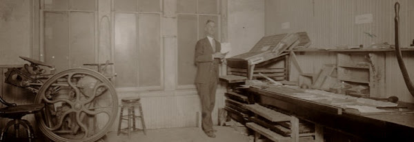
A number of problems cropped up right away, things that had not been so evident on the small forms I had printed to that point such as a business card. First was the roller and truck issue as it affected inking the form. The perf cuts in the rollers were bad at one place and created a white line that moved around slightly. The truck tires being out of round caused their own difficulties. And to add insult to injury I realized that the platen I had so carefully adjusted needed tweaking. I could deal with the platen but had to live with the rollers and trucks for the time being, not being able to afford replacements. The texture of the laid paper did not help. But for all of those things, it ironically still printed as good as some of the cheap and quickly printed originals I've seen. It was certainly readable, if no acme of the printer's art.
Fast forward to the present day and the advent of my great 10x15 press with good rollers and steel trucks. Now you would think hey, now we're cooking with gas, right? Well, sort of. Everything certainly went much better and the print was far superior. But the fly in the ointment was that I had taped the rails to get the rollers adjusted and had been pretty happy with the business cards I had done but I should really have taken more time to experiment. I had signed up for a great letterpress swap (letterpressswap.blogspot.com) and was pressed for time (no pun intended) so even though they did not come out as well as I would have liked and as the press is capable, they're OK.
What I needed to do and have subsequently done is to remove a couple layers of tape from each rail so the rollers would press a bit more into the form. Once I did that I got great inking and nice prints without makeready using the same form. Not that it couldn't have used a touch of makeready here and there to really get it just right. The type was a bit worn and though I replaced a number of sorts it could have used a little onionskin here and there. So the moral of this story is to take your time and go the extra mile.
As my first real project I was reasonably satisfied and I learned a good deal more about what constitutes basic adjustments. You can see the results for yourself below. Wild exclamations of approbation and constructive criticisms are welcome.


